
Today, your digital service can be used on a wide variety of devices. They can be “immovable” — like a desktop PC, or carryable — like a laptop, a tablet or a mobile phone. Right there, we have a high number of different devices that can work in unison. However the categorization does not end here.
They all come in varying shapes and sizes, with different screen sizes, operating systems with their own visual identity, hardware powering them underneath, and above all, they are used in different circumstances or contexts. All those factors should have an impact on the way you design and develop your product.
Let’s take a closer look at how these factors change the way your product works and the different challenges they bring to the designing process:
Characteristics, Potential & Limits
Screen Size
We set it as a number one, maybe not in importance, but because it is the first thing a designer should think of. It can be viewed as a blank canvas, a fixed virtual area defined by a width and height. Different screen sizes have a bit impact on your design, as they allow a different number of elements to be shown on the screen without swiping and scrolling.
Sometimes designing with a set number of limitations can be the easiest. Having to fit all your features into a fixed screen size is not. It requires care and many iterations.
Device Hardware
Often overlooked, yet incredibly important. You product obviously has a certain minimum requirement in terms of hardware in order to run smoothly.
Not everyone will have bleeding edge technology at their fingertips. Due to the fast evolution of hardware, there will be a huge difference between a brand new device and an aged one (plus here, “aged” can describe a 2-years-old device as well as a 5, 6, 7 years-old one !). This factor also depends a lot on the device’s level in the line : an entry level device’s performances will be radically different from the top of the line, and this is, with a few exceptions, true for every brand on the market. People’s laptop, desktop computers or mobile devices might not have the latest and greatest components, and they might still be using an older 4:3 ratio monitor.
Your design must grasp and comprehend this infinity of users’ set-ups, regardless of their hardware.
Tests on different types of hardware may help you identify if your service delivers a pleasant navigation on the main part of the devices that your customers are supposed or expected to use.
Usage ways, context and style
This is a more complex characteristic. Under this section come all the potential ways a device or a product on a device might be used. How, when and where. How many features will the user be able to comfortably utilize when having a poor/degraded connection? Should he be able to use the service while completely offline and which part of it? How does it impact the experience? Depending on the nature of your service, a user might want to use it on a bus or while lying on a bed and having only a tablet at their fingertips.
A crucial thing to remember is that, a device with a lot of possible ways — in regards to how it can be used – has a lot of potential! It might be hidden, or not visible on first sight. Look for these small windows of opportunity, because they might not be developed yet.
Being innovative in the process of designing new experiences or ways in order to utilize more of a device’s full potential can lead to great success.
The nature of technology
Keep in mind that the usage and specification of a typical device changes over time. What is now considered a tablet might one day turn into something radically different. The technological landscape is adapting and evolving rapidly.
Ten years have passed since the introduction of the iPhone, and nine for Android. Almost seven years have passed since Steve Jobs showed an iPad to the world.
When a new device such as that one is created, it can result in a tectonic shift. Tablets are nowadays considered the norm, however when first introduced people were wondering why would anyone need a bigger mobile phone — without the ability to make cellular calls! And yet tablets found their market, and their way into the homes of millions.
Some other technologies and services that tried to exploit them did not work that well : connected watches did not prove they were indispensable yet. I do not know anyone browsing the web on is connected TV neither. Will eBooks readers and their ink screens survive with the rise of better screen technologies on smartphones and tablets ? What could be the impact on our lives of home entertainment robots like Keecker, and augmented reality technologies like Microsoft Hololens?
Let’s also remind that a revolution in technology is never an end. The latest generation of every device is far from what was their first iteration : look at iPhones & smartphones, iPads and tablets. Brands learn the real usage made of their products, and its evolution, to adapt them in time.
Mobility versus Immobility
Mobile phones and tablets
Long gone are the days when these devices were used only for surfing the web and checking e-mails. A high-end tablet or phone has higher computing power than a mid-tier computer from a couple of years ago, so it is not a big surprise that companies are utilizing that hardware in order to provide extremely complex and amazing services.
However, portable devices come with certain limitations that cannot be avoided. Tablets have the same operating system as do mobile phones – iOS on iPads and mostly Android on non-Apple tablets. This allows developers to create a single application that can be used on both types of devices, with small tweaks in order to accommodate the different hardware and screen size.
While they cannot match laptops in terms of productivity, they can come close, with companies creating full-fledged CAD vector illustrations, design and office applications.
These devices have smaller screens and when using them the user’s fingers take up a certain amount of screen space, narrowing it down even further. These things are logical, but they also represent very concrete limitations that exist with each of these types of devices.
Desktops
Desktop computers are often viewed as big, clunky and immovable. Over the years a certain stigma developed around them. People started categorizing desktop computers as devices “reserved” for serious, often complex work. Such a stigma might be a challenge for a product creator/designer, but there will always be a good chunk of “power users” who will always prioritize working on a “full-fledged” desktop computer. Outside what it indicates on the user itself, when paying attention to the context your service will be used, the desktop case is also indicating that, in most of the cases, the use is made from work or from home.
Laptops
Laptops offer the functionality of a desktop computer, with a certain degree of mobility. Over time users created a craving for high productivity “on-the-go”, and these devices respond to our nomad ways of lives – having to work or to use them in the transportation, going to a meeting, at a cafe, when visiting someone, outside home or offices in general.
When we talk about designing for such devices, the latest generation comes with few differences compared to a desktop computer, except that more and more models now contain touch screens in addition to their keyboard.
Hybrid devices
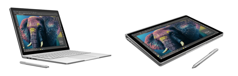
A very interesting type of device that is getting traction over the years is a hybrid device that can function as a laptop but also as a tablet. This allows the manufacturers to have high-end hardware, but retain the mobility people love so much. A good example is the Microsoft Surface Book, that offers some of the best components you could find in a portable computer, yet can also be used as a tablet. On top of it all, it runs a full 64-bit version of Windows 10. While this “2-in-1” concept is nothing new and the price tag can seem astronomical, it proved that a device can combine best of both worlds, and was positively received.
Inputs
When it comes to design websites, softwares or applications (user interfaces), considering the way a user will interact with it is the top priority. And it depends a lot on the device used, mostly between two main situations – physical inputs (keyboard, mouse) or emulated inputs (touch controls) :
Keyboard and mouse
The traditional way – there is not a lot to say about it, exactly because it talks to everyone and is (used to be) the generic context for which every software or website is developed.
With the rise of mobile-first design however, the fact that the designer must now anticipate the space that the keyboard will occupy in a touch screen, reverses the way applications are designed for devices with large screens and physical controls, giving new possibilities when extending the design to the “desktop” version.
Touch controls
Mobile devices (smartphones and tablets) are limited, in most cases, to touch inputs only. Touch controls have their pros and cons, they can be intuitive and fast considering the navigation through the pages or features of your service – user does not have to move and position a mouse to the clickable area.
But they are not that exact and precise, or better said, our human hands and big fingers won’t be able to work that efficiently on an emulated flat keyboard on a 5.5-inches or 12-inches screen, than on a physical keyboard.
The question of the space occupied by the keyboard on a mobile device screen, that degrade the space available for the content of your app, is also an inevitable inconvenience for the user. You must manage to keep the key information visible while a user is using the keyboard.
The rapid advancement of technologies
It is important to note that the limits of a device are constantly changing over time. What is a limitation now might not be in six months time and vice versa. Tablets and mobile phones get updated every year, mostly in hardware but also in software. It is not unheard of a system update springing new life into an old and forgotten device, since every new version of the operating system gets better and uses existing resources in a more efficient way.
The real potential stands in a unified experience
All the things detailed above are concrete differences in the potential and the limitations of every type of device. But the biggest potential, when we talk about designing for several devices, lie in the possibility of building a unified experience for a service as a whole, across different platforms and devices, using their permanent connectivity and their communication abilities.
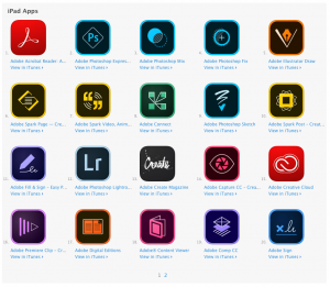
Adobe’s apps synchronization for productivity and collaboration
Adobe is a great example – they created companion apps for most of their services and offer them for free:
Adobe Companion App
You can give your users a set of shortcuts on their tablet, or perhaps their most used tools. The possibilities are endless.
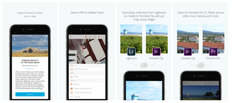
Adobe uses this to it’s full extent – allowing users to design on a computer and prototype on a mobile device, exchange files to and from software like Photoshop, Illustrator and their own Creative Cloud and even edit a clip on their phone, and send it wirelessly to their computer with all edits, sequences and markers preserved in order to continue working on it in Premiere Pro.
As almost every user has a smartphone, it can be a wasted opportunity not to develop a synergy between these devices. Depending on the nature of your product, developing this “multi-device” communication may or may not be of vital importance. However it does offer a very fascinating opportunity to create something unique and amazing.
Spotify’s unified and connected experience
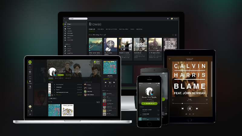
Spotify
When you take a look at any widely used digital app or service, you might notice that — while probably beautiful — it is not pushing any boundaries in terms of design or innovation. Why that?
For example, why does Spotify look so simple?
Spotify, as of March 2017, has 50 million paid subscribers, which does not count the non-paying users. They have native clients for Windows, macOS and Linux as well as iOS, Android and Windows Phone. (they even have apps for Blackberry and Kindle Fire but are starting to cease support because of the small market share those operating systems have).
They do not have a single user group left out!
When analyzing their overall interface design we can wonder why do not they have more visually complex UI elements, or a more “premium looking” font? Or some transitions? All those elements, while beautiful and phenomenal in their own rights, are strictly visual. They add a premium feeling to the service, but it won’t make a difference to the average user. They want to get to their music library as soon as possible, without any obstacles, and when searching for new music that same philosophy applies — less is more.
Secondly, having a simpler user interface allows them to replicate the same feel and tone of the application regardless of which device it is being used on. Retaining those elements is incredibly important. Allowing the user to switch their operating system, download their service and feel “right at home” is of the utmost importance.
Third — keeping things “basic” and easy to use allows users that have somewhat outdated mobile phones or tablets to use their service the same way someone with an iPhone 7s can. Again, no user group is being left out.
Forth — may be a detail for you, but an interesting one. Spotify paid attention to details up to try to remove any friction in the use of their app, at the precise moment you are switching from an app to the other. Now, the app you’re switching to will resume the last music you were listening to, at the precise moment you stopped the song.
This attention to details, and perfect understanding of the market as well as the needs of their users, is eventually what puts them high in front of their competition.
Last but not least, Spotify understood it was not an end to allow their users to use the service on several devices at different moments in the day. By their nature of on-demand music streaming service, they understood that the next level would be to make the devices themselves to talk together, including with other types of devices, like connected amplifiers, radios, or speakers. The introduction of Spotify Connect was another step in building a great music experience.
Designing a great user experience on every devices
To you as a service provider/designer these things matter. You do not have to know the history of these platforms or devices, but you must understand, and constantly keep up with the potential and the limitations of the device you’re designing for.
Knowing its true potential allows you to make wiser product & design decisions with the end-user in mind, to build the best user experience possible.Not knowing its limitations can result in an unsatisfying product, that can get even very frustrating and a negative point for your brand, if not working properly.
Change is inevitable, so be prepared to adapt as well. The changes that do happen are never so dramatic that you won’t have the time to adjust, but if you are creating a product — look at the bigger picture. By doing so, it is almost a guarantee that what will result from it will be something entirely unique and phenomenal to use.
 Why Startups Should Not Seek Media Buzz At Any Cost
 Psychology of Choice applied to Web & App Design: Convince Clients!
 The Buyer Journey: Nothing More Than a Series of Questions To Answer