
Typography is one of the segments of digital products whose importance is often undervalued. Text is a primary form of content, and most of the time, designers don’t consider putting significant effort into typography, which is one of the reasons for a huge amount of services being visually lacklustre.
Text is never just text.
It conveys information towards visitors, users and customers in the clearest and most direct way possible. If it is not nice-looking, organized and designed in a thought-out way, then the message won’t be as clear as it could, whether the objective is to convert, engage, or retain people on your website, web app or mobile application. The visual side of your product will be off-putting.
When working on UI and UX, designers should more often consider treat text as a full-fledged interface element.
The usual mistake here, is to treat text as just a cluster or characters that needs to be “nicely shaped”. Approaching typography requires care, and the opposite of a mechanical approach.
In a best case scenario, this approach results in a cliche design. At worst, it may result in an unclear message sent towards your users.
In this article, we introduce a few things to keep in mind when designing UI, that might help you to realize the full benefit and the importance of a great typography.
Choose a font that looks good in all sizes.
You could use a single font with multiple weights across your product. The same font will be used for headlines, body text, buttons as well as your navigation. Since they all require different sizes, make sure that your font satisfies all requirements regarding readability.
-
Font size – plays a huge role in readability and visibility. Also note that the font size shouldn’t stay the same depending on the screen size. It should adapt, like any other element of your product. Something easily visible on a desktop monitor might be too big for a tablet or a mobile phone.
-
Font family – keep in mind that fonts might display differently on different resolutions, especially serif fonts.
-
Text color and contrast – having a bigger, more noticeable contrast is always better. Also, the color scheme you go for can have an important effect – long paragraphs of white text with a black background will strain the user’s eyes.
-
Line spacing – defines the space between every line of text. Making it too small will negatively impact readability!
Go for a font that represents your product.
Different fonts elicit different emotions from viewers, and a font can by all means represent the values you stand behind as a company. Using a serif font for your body text (like Instapaper does) or going for a clean and “modern” sans serif font makes a big difference.
Obviously some of these feelings are subjective — you might like one font and someone else won’t, but there are certain archetypes that can always be applied — serif fonts being elegant, and sans serif ones modern. Decide what kind of message you want to emit, and go for a font that speaks that for you.
One font, two maximum.
When possible, use a single typeface. A single font is all it takes to establish a strong visual hierarchy. You can go for two, but the execution becomes more difficult.
When we talk about combining fonts, you should have a couple of things in mind:
-
They should be visually complementary.
-
They should not be too similar in design. They should be different enough to differentiate and justify mixing. (sans serif and serif fonts for an example)
-
Consider using different fonts for different types of content. Decide what is most important and what should stand out the most and choose a font/weight accordingly.
Create contrast
Whether you choose to use one or two fonts, if you pay attention to what is up recently on design, it is incredibly important to deliver your content with strong contrast, to establish a visual hierarchy that mirrors the importance of your content It can be achieved through a myriad of ways — font weights, style, letter spacing, color, etc.
Some examples of contrast that work:

Fonts used: Futura and Brandon Text
Fonts used: PlayFair Display and Futura
When in doubt, you can resort to the default fonts
If you have doubts about which font or font family will suit your product best, there is always the safest method of resorting to a system font.
What this simply means is that, instead of investing time and energy on finding the perfect specialized font for your service, you will rely on the consistency of largely-used and visually recognized fonts. Doing this brings the risk of looking bland and uninteresting, however at the same time the average user doesn’t differentiate the smaller nuanced differences between similar fonts, especially if the font size is smaller. Nonetheless when going up in size it becomes very noticeable.
Now, when speaking about “system fonts” we do not consider overused fonts like Arial, Verdana or Bodoni, nor Lucida Grande. Although these titles mean a lot, even for someone into typography, and although they come “pre-packaged” with every desktop operating system, for decades. While they are fully functional and created with great care (means, no mistakes in the font’s technical aspect), you will almost never see them being used anywhere other than a student’s essay, or someone who literally resorted to a default font in a text editor. Pay attention to the implied message certain fonts can send – let’s not talk about Comic sans.
Use existing fonts, or make your own?
Apple has been using great fonts for the last couple of years for all their needs — Helvetica Neue on iOS and the Mac (they’re using their own font San Francisco at the moment), while Google has been using their own Roboto for Android.
One of the biggest changes in the typographic world over the last couple of years is surely Google’s vast project Google Fonts in 2010, which was started in order to make the web faster and more beautiful. Over 800 fonts are available completely free at the time of this writing, and most of them are staggeringly beautiful. Most Google Fonts like Roboto, Open Sans, Lato, Proxima Nova, Montserrat are used all over the web, in all kinds of services and products — SaaS, mobile apps and even printed material.
Perhaps the best option you could go for is creating a completely new, unique font. The are numerous benefits. You can create something from the ground-up, and stylize it exactly how you want it. By doing this you will get a font that no one else has, and that sends a very concrete message to your users.
Creating a unique font takes some time and a lot of skill (when possible, it should be done by a professional typographer), but the value it may add to your design is important as well.
Think about smaller screens
It cannot be stressed enough that, with the rapid technological advancement, people started using digital services in a lot of different ways. There is now a hefty and growing group of people who only use services on their mobile devices — tablets and mobile phones.
If you want to retain readability when users switch over to a smaller screen, you should always design for a smaller screen as well. That often means restructuring and some minor reformatting of your content which doesn’t require a lot of time, if you did not yet adopt a mobile-first mindset. But can make a world of difference to someone who has to use your product “on-the-go”.
Typography is not only about the choice of the font – it has a lasting effect on the end product and its usability.
Bonus : an example of good typography
If we take a look at this upcoming redesign of Windows’ design language, we can clearly see how big of a difference good typography can make:
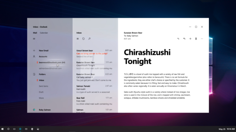
Preview for Microsoft’s Project Neon visual update. (also known as Microsoft Acrylic)
How did they achieve this clean design using almost only typography?
-
Lots of empty space — this gives every used element more space to “breathe”
-
Three weights of a single font that establish a visual hierarchy
-
They introduced just a single color — a strong orange — to help highlight the most important aspects, messages, etc. Using that one color, they can highlight certain UI elements as well.
It is definitely a trend in typography that will be used in more and more websites, and that you should follow. It sets the focus on having a minimal number of images, clean typography playing an integral role in the product, a beautiful color palette with few minimalist icons. The choice of font, its weight, color, size and placement become a dominant part of the design process
It is not much when you look at it, and it shouldn’t be. It is all it takes to make something look great and inviting to the user.
Look at some other examples:
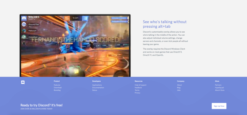
Discord.gg
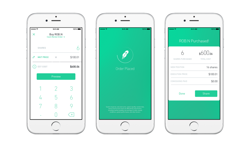 Robinhood app — Apple Design Award Winner 2015
What to remember
Creating a product is an incredibly creative and challenging process. Every product is a multilayered container that requires expertise from various people and experts. To make matters more complicated, making a mistake early on in the process can leave a mark elsewhere later, and it doesn’t take a lot of mistakes to eventually end up with a product that is not up to par with what you had in mind.
Having a visually unappealing font won’t ruin your product. However, your goal as a service provider should always be to make your product as unique as possible, and focusing some time on typography is an important step towards that. That is why you should always invest time into shaping that message in the best way possible.
God is in the details. — Ludwig Mies van der Rohe
Design trends change, and the impact typography has on your product changes as well.
Nowadays the most beautiful, clean designs use typography as their main element and you should ask yourself how you can take advantage of this trend, within your own product strategy. Find out how typography impacts your service and embrace it. Find how it can make your product unique on the market.
 Why Startups Should Not Seek Media Buzz At Any Cost
 Psychology of Choice applied to Web & App Design: Convince Clients!
 Brands: Joining Battle For Customers’ Hearts, Not Just Pockets