
Delivering a pleasant navigation for every single visitor on your website, printing your message in any visitor’s mind after just a few second is a real performance every website owner should in-fine be expecting from his service.
Expecting the diversity of people that will visit your website, and the small amount of attention and time they will have to devote you, making such impacting and positive impression is a battle which is far from being won. Do not count on people to give you their attention, be open-minded, and even less be interested in your service at first.
So you need to be outrageously persuasive at any instant, and in that regard, leading visitors to your objective will often require you to use of “ruse”. They are uncountable: personalized product list to drive more traffic to your product pages, for e-commerce businesses, customized landing pages addressing segments of prospects, for SaaS software, gentle not-that-invasive pop-ups on blogs, to generate subscriptions …
You need to sell, but -most of the time- visitors don’t need to buy.
While website designs and usability tend to improve and standardize (for the good) in time, new performing marketing & growth techniques appear, gain popularity then become overused and their impact decrease – do you remember the first time some blogger asked you an email to access some resource?
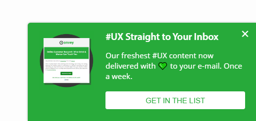
By the way, by clicking on this image you can join our own mailing list, don’t be shy !
With the same mechanism that make you ignore most of the advertisement you will go through within your day, visitors learn to avoid to fall in the trap: they don’t look anymore at top bars, immediately close pop-ups, and are not even amazed anymore in a 70% discount tag.
And the story starts over, you must find and consider other ways to catch visitors’ attention, lead them to the conversion point, and eventually get their money.
Because you need to exist, there is no clean way to generate more interactions with your service. There are ways.
Taking advantage of some expected or assumed Human’s behavior is not the most glorious thing, but it is one of these ways, and not a crime. Isn’t Dale Carnegie’s 80-years-old How to win friends and influence people a best seller? (ed. anecdote: someone decided that it could be fun to simply name it: “How to make friends” in my native language).
Let’s review how you can take advantage of people’s propensity to get frustrated by things, and from their way to express it.
People’s frustration
The Human mind has:
-
a natural affinity with order, well-proportioned and nicely-designed things.
-
a highly critical thinking, and a propensity to express it
People easily express it when they are not satisfied with something (anything: a situation, an opinion, the way something looks … ). Way more easily than when it comes to express positive feelings.
Facing elements that go against the order of things may trigger some alert signals in our minds, that drive our attention to them. This propensity Humans have for criticizing and complaining comes from the frustration generated by all the interactions we have with the outside world, the other, or anything.
Everyday, we face a billion small insignificant situations, but the ones we remember, are mostly the good ones, and the unpleasant (frustrating) ones.
Unpleasant like:
-
Not being able to access something we want
-
Not finding a solution to a problem
-
Feeling or being limited in the use of something
-
Being hurt – literally or figuratively- by something
So small may be these pieces of frustration, they are unpleasant. Well, these characteristics can be used at your advantage.
Sometimes introducing a certain level of frustration in your product might help you leveraging your business, by taking advantage of your visitors’ assumed will to solve the induced problem, reduce their frustration or again satiate lower instincts.
Leverage sales, by introducing a small amount of frustration in your product, alongside with a (paying) way to reduce it.
Wisely setting (frustrating) limitations in plans to encourage upgrades
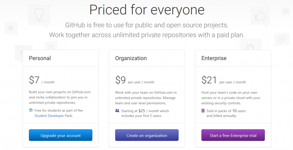
Github.com – “you can use it for free but everyone will have access to your code”
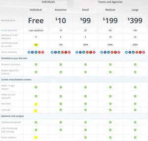
Buffer.com – “we have great features, but only in our paying plans”
Setting both a (frustrating) wait list and a way to skip it by paying.
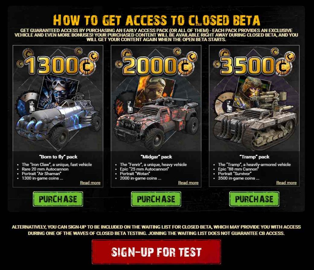
Crossout.net – free-to-play but you must pay to access the beta or join our wait list.
Setting a (frustrating) restriction on content for non-customers to encourage subscription
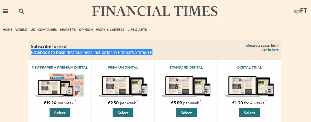 FT.com is not even offering you to read an excerpt.
Dressing your website with (frustrating) ads and offer to remove them by paying.
This one does not even need an illustration, right?
People’s curiosity
The above-mentioned examples are all driven by a sales outcome. Creating the frustration is used as a manner to prepare people to action, before you actually serve them a Call-To-Action (CTA) which introduces the possibility for visitors and users to reduce the induced frustration.
Now, such techniques can be more largely used, in a more straightforward, direct, and specific manner, on any website, to drive people towards any specific interactions – not only a conversion point.
Driving attention to something
Curiosity is a hardly resistible feeling. This makes it an opportunity to create interaction with visitors.
You can for example, apply click-bait principle within your website. Click-bait implies catching the attention of someone thanks to curiosity-raising visual content or wording. “Click-bait headlines typically aim to exploit the “curiosity gap”, providing just enough information to make readers curious, but not enough to satisfy their curiosity without clicking through to the linked content.” – says Wikipedia.
In other words, if we apply this principle to your service, that would be about making any further interaction irresistible.
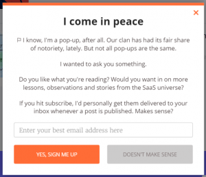
Chargebee.com – definitely not the usual pop-pup, raising curiosity by its abuse of honesty.
Breaking the monotony by going out of context
Introducing a break or an exception in a design is a great way to outline the importance of an element and bring the focus and attention to it.
When something as simple as a wording or a choice of colors may substantially change the behavior of visitors, isn’t introducing a radical element in your design a great way to generate interactions ?
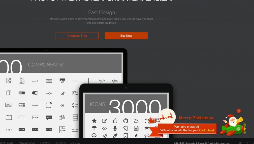
Mockplus.com – clean and straightforward 3-colors based & not-scrollable design. And this ridiculously out of context pop-up (in term of design, not period: it was Christmas!) that you can not miss.
Telling a lie to get at the truth?
Telling a lie to get at the truth, is a common and instinctive way to obtain an information from someone or spot a lie.
I do not know about a large track record of such implementation in web experiences. However I’ve recently been into such experience once randomly visiting a website, which made me consider this case – and actually drove me to write this post. The credit goes to Nimber.com.
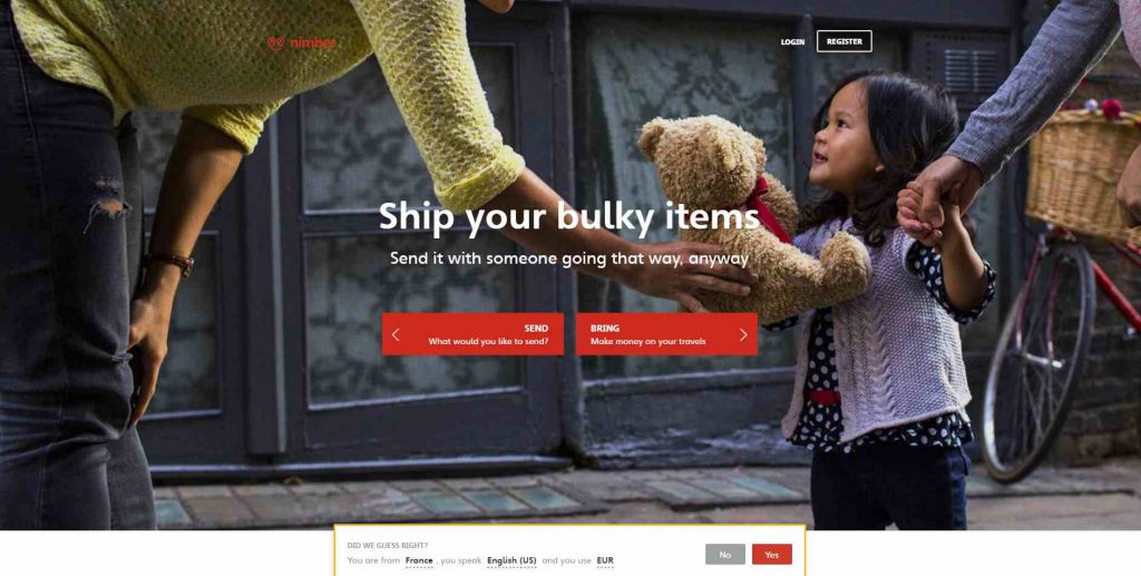
So as usual, what you do is completely ignoring the bottom-appearing pop-up. But ..
![]()
On the second page, this particular one tickled my mind and got my attention :
“Did we guess right? – You are from NORWAY ?
Far from it.
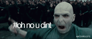
Then what happens ? Hard to ignore it. I felt I had to correct that, and signify these guys how wrong they were – at least to let them know that their IP / user agent reader was doing quite wrong. I got to see what will happen if I say : “No, you did not guess right – because you ask”. The temptation was too high. I clicked, and .. well, I was invited to rectify the information.
That’s it. I did not even rectified.
At this moment, I was expecting more from this interaction. I was disappointed that nothing crazy happened, like “SORRY FRENCH DUDE WE’RE KIDDING YOU ON PURPOSE”.
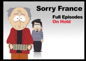
A very sad part of half the planet’s life – before we all got a VPN. – southpark.cc.com
After leaving their website I realized that they made me:
-
interact with their website while I was not going to – as they were not delivering service to my country
-
interact on a pop-up, which never occurs
-
interact on a pop-up which did not “converted” the first time (it was correctly set to France on the first page)
Quite engaging buggy script that we have here! And it could be a great demonstration of the potential impact of such misleading elements on other websites.
Have you said sneaky? What about you, have you ever met asuch situation where a website / app is patently misleading people to drive them to interact – telling a lie to get at the truth ? We’ll be happy to read your comments.
That also reveals the possibility to exploit People’s ability and need to criticize things.
People’s propensity for trashing
We all deplore when people complain about our service, and we hate when they go public for that. But deploring or hating do not make things move. So, don’t spend too much time on it, and focus on which conclusions you can draw from that.
Negative feedback is feedback.
People complaining about your service actually give you a great way to improve it, thanks to their feedback.
You should thank the people who say your service is shitty (as long they tell you why it is so)
Here are some outcomes you can expect from exploiting peopl’s propensity for trashing :
Rating your content, knowing the users’ need for support
Offering to your users a way to rate (negatively) a content, is the best use case.
It mostly concerns FAQs, documentations, help sections, onboarding programs, or in general any other training / assistance content : the users are at the moment in a phase of unresolved frustration. If they make the effort to tell you why your content is not helping, or what they did not find there, this is very valuable information.
![]()
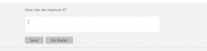
Microsoft Office Support’s 2-steps feedback bar does the job quite simply.
Nurturing your user base with qualitative data
If your service is based on content, offering them to give such feedback also allows you to understand users’ preferences and nurture their profile with data. For example, to avoid serving someone a content similar to something down-voted, or in the contrary recommend similar content to something liked, in a logic of delivering a pleasant experience.
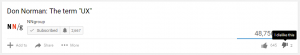
Youtube.com – easy example. Don Norman’s definition of “UX” seems very right if you look at the like / dislike counter.
Generating a first, or more interaction(s)
At the moment a user gets to the point when he needs to complain, it means that you are in danger. And that he might leave the website at any moment, cancel his subscription to your service, visit your competitor …
Offering him a way to complain is a way to immediately generate more interactions, and keep him connected longer.
That matters. During this time, he can find out a solution to the problem thanks to your help content, consider to raise a ticket to your support team, or just calm down. Which is my next point:
Reducing the pain by offering a way to complain
Expressing our anger is a way to diminish it. It is a way to reduce the importance of the problem and its mark on ourselves, especially when there is nothing else we can do about it.
Give your users a punchbag, because sometimes they will need it. Better taking the knocks and facing your responsibilities than having your users cursing you on every social network.
Turning negative situations in positive experiences
There is no inconsolable pain. Finally, what people offer you by expressing their frustration, in a constructive perspective, is not more than a opportunity to solve their problem.
And what is also in the Human nature, is gratefulness.
By acting with positive intent in response to the critics you may face, you take the opportunity to solve positively a situation, and turn their anger into loyalty, by delivering way more than they were expecting.
Dealing with frustration – careful!
The examples and techniques presented here in the perspective of the Human’s frustration, curiosity and propensity for trashing may help to build better conversion rates and customer experience.
As a final note, because we are talking here about techniques and ruses, applied to customers – real people. I can not urge you more to be careful with the way you manage your users’ & customers’ frustration – this is a risky business. There is a limit to the use of these techniques – especially when we talk about voluntarily inducing frustration in the experience.
Do this without a solid product or service behind, and what you will do is actually just tricking people. But wisely and carefully inserted in the experience of your service, they can actually benefit to both every of your users, and your business.
Building a great product relying on a great idea remains the key !
 Why Startups Should Not Seek Media Buzz At Any Cost
 Psychology of Choice applied to Web & App Design: Convince Clients!
 Brands: Joining Battle For Customers’ Hearts, Not Just Pockets